
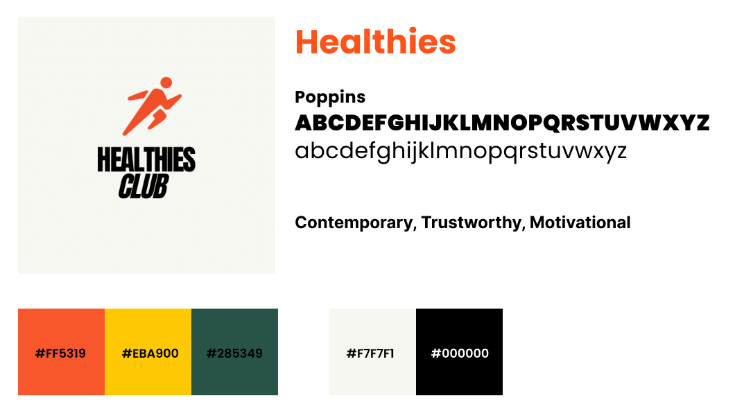
Healthies Club

PROJECT
Fitness Tracking App UX Case Study
ROLES
UIUX Design and Research, Brand Identity
TOOLS
Figma, Miro, Marvel, Google Docs and Slides
Problem
Healthies Club, a health and fitness tracking app, lacks a messaging feature, which reduces user engagement. Users typically separate their fitness activities from social interactions, limiting their motivation to interact with the app.
Solution
To enhance engagement, Healthies Club will introduce social features such as community messaging and friend challenges. By integrating social and fitness activities, the app aims to motivate users to log their activities more frequently and foster a community where users can join clubs and meet locally, making fitness a more collaborative and enjoyable part of their social lives.
Industry Research
I conducted a comprehensive analysis of leading fitness apps to explore their messaging features and identify opportunities for enhancing user engagement. This evaluation highlighted key strengths and weaknesses that informed our design approach.
Key Findings:
Nike Run Club: A user-friendly app that effectively integrates social features, boosting engagement through shared achievements and community challenges.
Productive Habit Tracker: Its visually appealing design and gamification promote habit formation; however, limited customization options and feedback mechanisms may deter users seeking more control.
Map My Run: While it offers robust community features and detailed performance tracking, its complexity can overwhelm newcomers, alongside limitations in privacy controls and social integration.
For the complete report, please click here.
Milestones and Deliverables: A Detailed Timeline
With a tight 90-hour deadline, I created a detailed project plan that allocated time for each task. By breaking the project into manageable steps and staying focused on priorities, I avoided delays and ensured everything was completed on schedule. This approach allowed me to deliver a high-quality final product that exceeded expectations.

Detailed project plan
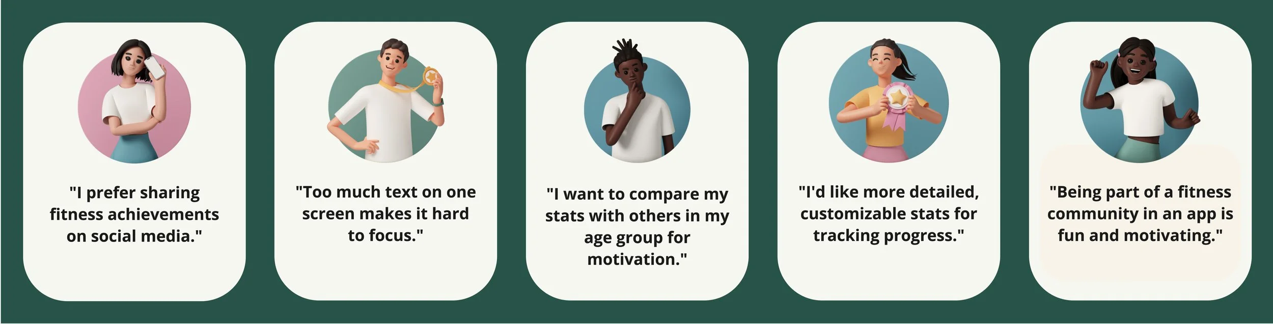
Key Insights from User Research
In the ever-evolving landscape of fitness apps, understanding user needs is crucial for driving engagement and fostering motivation. To uncover these insights, I developed a screener survey and conducted in-depth interviews with users to explore their interactions with fitness applications.
Key Findings:
Social Features:
Users value the ability to add friends, share accomplishments, and participate in challenges within the app itself. This seamless communication enhances their experience.Community Engagement:
Being part of an app-based fitness community adds fun and serves as a powerful motivator. Users are inspired by friends’ goals and workouts, leading to more frequent use.Gamification Elements:
Features like challenges, achievements (badges), and friendly competition transform exercise into an enjoyable game rather than just another task.Competitive Comparison:
Users expressed interest in comparing personal stats with peers who share similar age or fitness levels, further fueling their drive for improvement.Advanced Tracking Tools:
While basic tracking features are appreciated, there is a strong demand for more sophisticated tools that provide accurate and customizable data—particularly around calorie tracking and progress metrics.
These insights illuminate how our design decisions can better align with user expectations while enhancing overall experience within fitness apps. Click here to view the full report.
User interview summaries
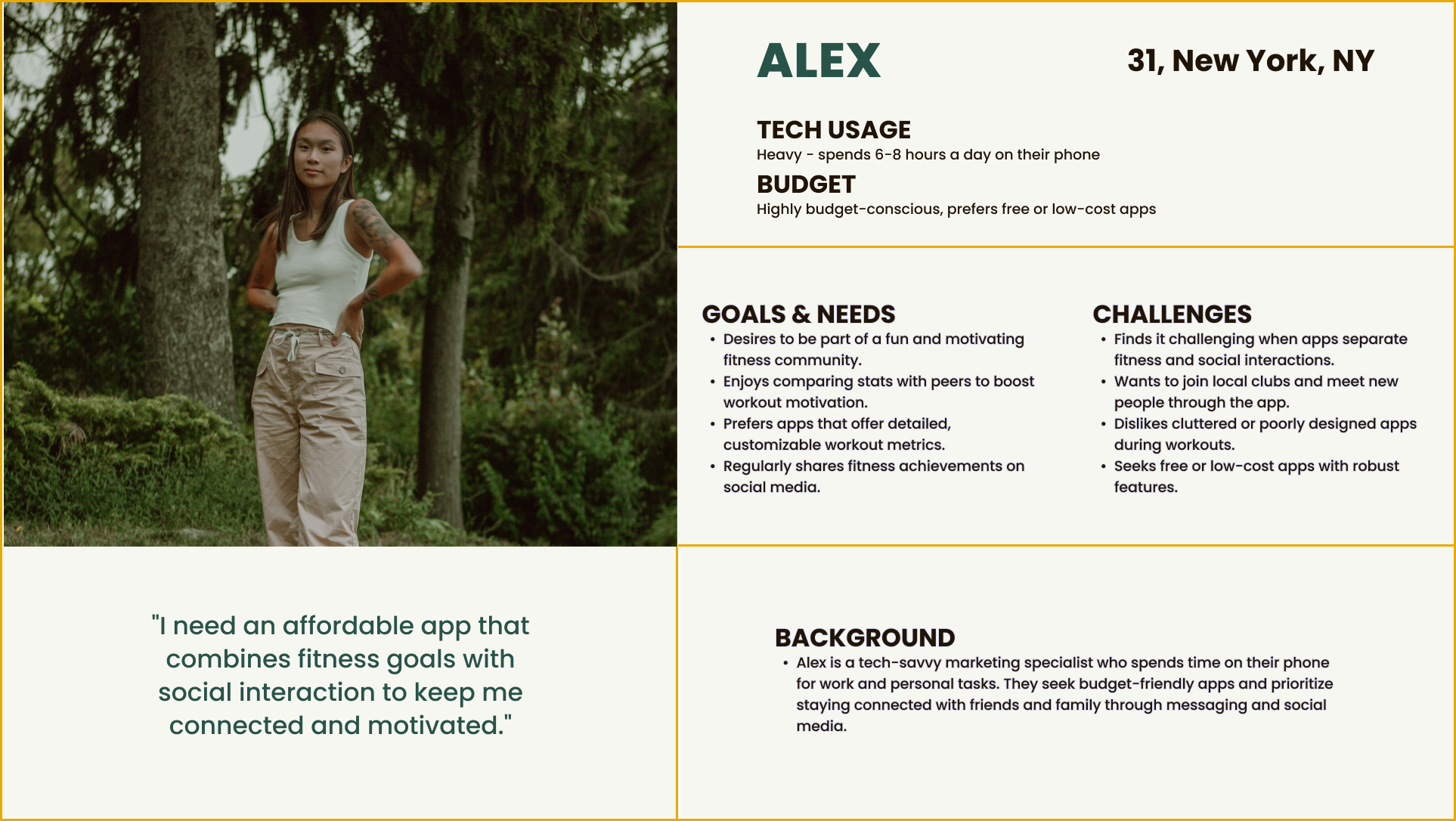
Meet Alex (user persona)
User Persona
Alex, a tech-savvy and budget-conscious user, seeks apps that combine fitness with social features, value community engagement, and avoid cluttered interfaces.

Site map
How Might We…
Considering Alex’s goals, we defined three How Might We (HMW) questions to turn problems into opportunities:
How might we create a seamless integration of fitness and social interactions within the app to enhance Alex's motivation and engagement?
How might we enable users to easily compare workout stats with friends to boost their motivation?
How might we make it easy for users to share their fitness achievements on social media platforms?
This guided the selection of key actions and features, leading to a sitemap design that aligned with these goals. I aimed for a seamless experience, balancing simplicity with user customization.
User Flows
I mapped the red routes to streamline the user experience. These outlines became the wireflows, showing users how to add a workout and create a challenge for their friends—two key tasks that must flow effortlessly.

Red Route 1: Logging a workout, ensuring a smooth, efficient workout logging process, aligned with the app's seamless fitness tracking focus.

Red Route2: Create a challenge for your friends , fostering communication and engagement.
Style guide First Round of Usability Testing: Lo-Fi Wireframes
I conducted a usability test with five participants on low-fidelity wireframes, working through six tasks to ensure the design was on the right track. This testing helped identify and prioritize key usability issues for further improvement. The tasks included:
Creating a fitness challenge
Inviting friends to the challenge
Checking messages
Viewing a friend’s user profile
Adding a completed workout
RSVP-ing to a class with a friend
After synthesizing the research, I identified three key issues that required attention.
Critical Issue #1: Disorganized layout of profile information
Major Issue #2: Option to “Share Challenge”
Minor Issue #3: Lack of streamlined method for “Finding Friends”

User Profile page

More options for Challenge page

Friends page
Second Round of Usability Testing: Hi-Fi Designs
To address initial feedback and discover new challenges, I conducted a second round of testing with five participants.
Focus of usability testing:
High-Fidelity Mockups: Provided a more realistic user experience.
Task Alignment: Revisited six tasks to match business goals and included previous feedback.
Findings Analysis:
After analyzing the findings, I identified three new areas needing attention:
Critical Issue #1: Confusing navigation labels.
Major Issue #2: Lacking visual engagement due to excessive white space.
Minor Issue #3: Simplifying the process for logging repetitive activities.
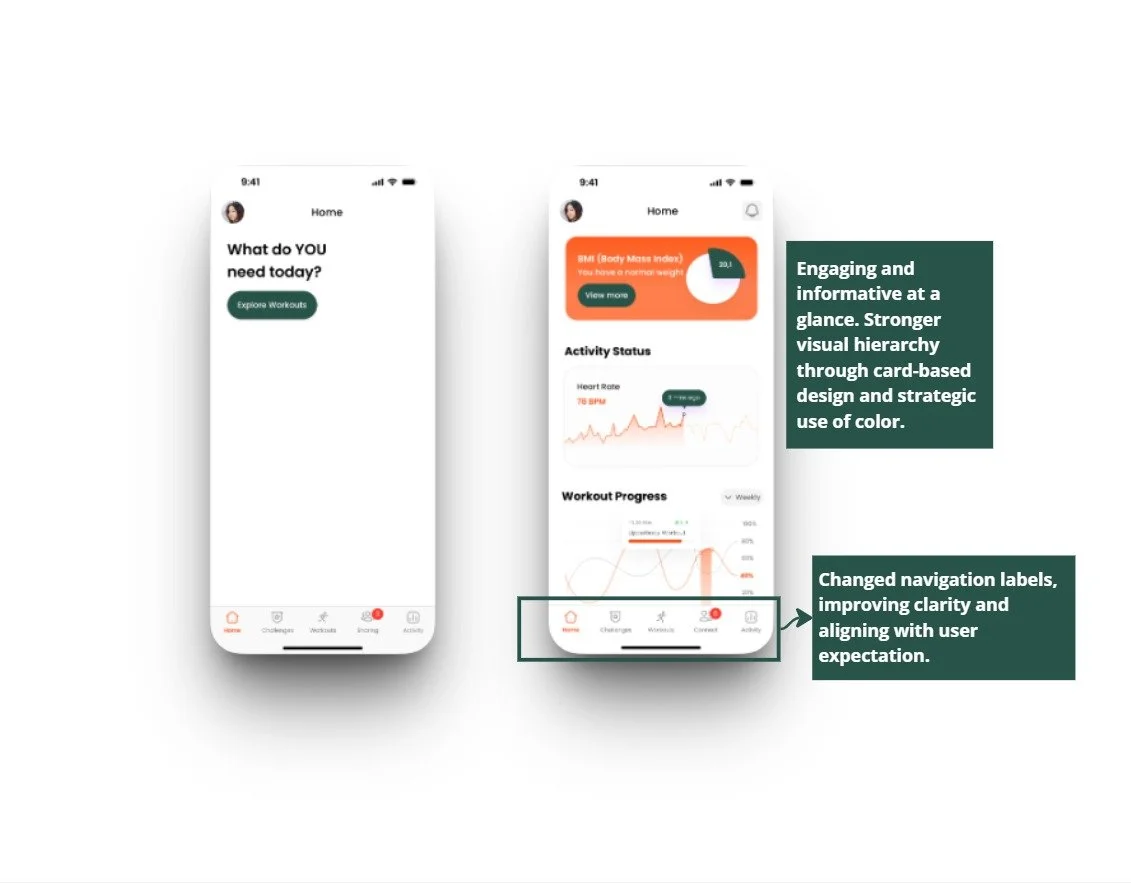
Clearer navigation labels and stronger visual hierarchcy
Default pre-fills and minimal layout

Retrospective
Throughout the process, I was reminded how vital it is to carry the “How Might We” mindset through every stage of the UX journey - not just during discovery. It’s easy to get lost in visual design or component building, but anchoring every decision to the problem statement is what drives clarity and purpose.
I also learned that even the smallest changes - like renaming a tab or adjusting a default - can dramatically improve user experience. Watching usability testers interact with the prototype, share fresh perspectives, and then implementing their suggestions to improve the product was incredibly fulfilling.
Feel free to explore the interactive prototype below and add me on LinkedIn!


