GramCity
It can be really frustrating to miss out on great photo opportunities while traveling. GramCity, a photo editing app that enhances users' photos for social media sharing, now aims to help users discover great photo ops nearby. Following the Google Venture’s Design Sprint method, I enhanced the photo-centered app by creating a user-friendly flow. This helps users quickly find nearby spots with excellent photo opportunities, complete with location details and directions.
PROJECT
5-Day Google Venture’s Design Sprint
ROLES
UIUX Design and Research
TOOLS
Figma, Marvel, Miro, Procreate, Google Docs and Slides
Day 1: Mapping
Discovering User Needs
I began by mapping out the potential customer experience for the new feature, focusing on two personas: Nick and Sara.
● Nick (24): A spontaneous traveler who seeks instant, nearby results without missing any good photo ops.
● Sara (27): A planner who schedules her photo ops based on popular and visually appealing photos taken by others.

User journey map
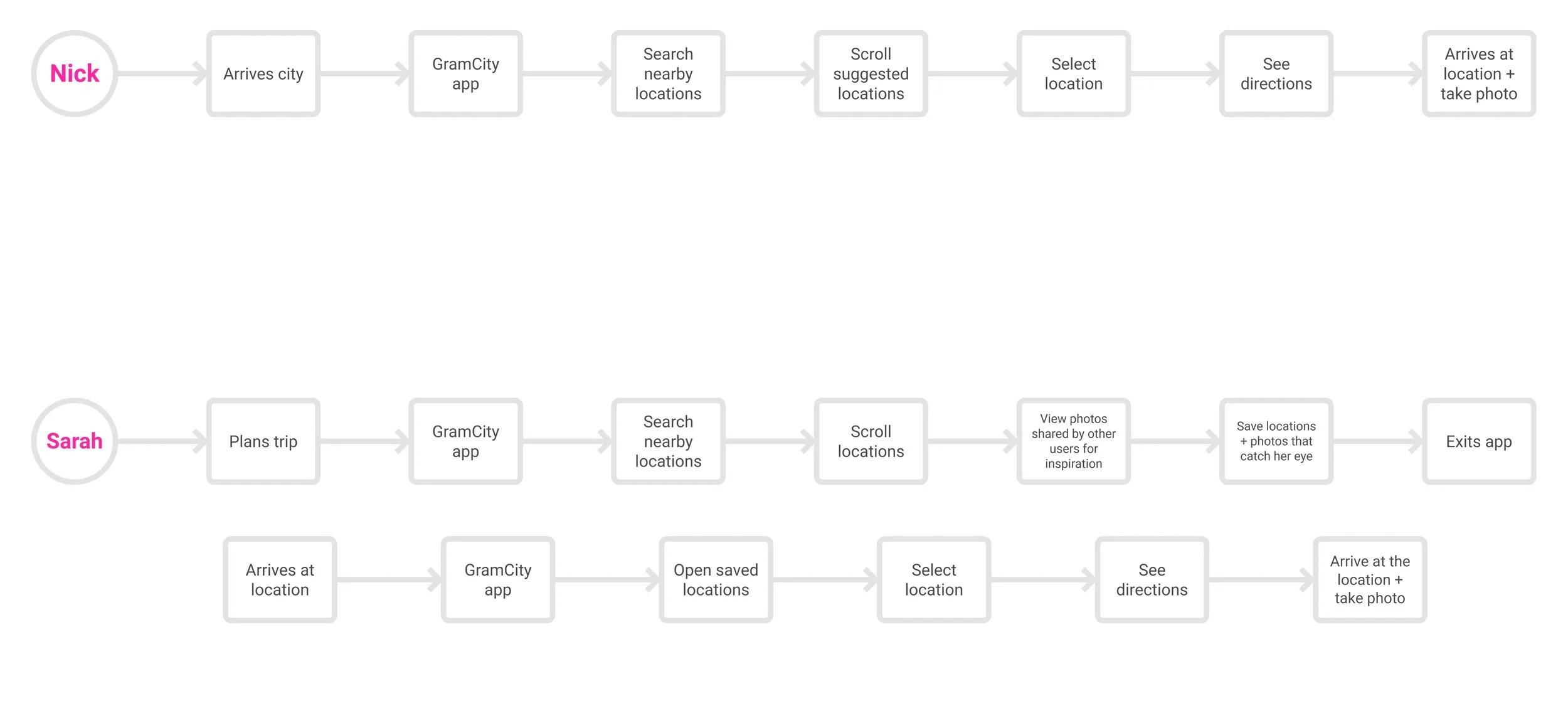
Nick dislikes planning and traveling for photos but wants to easily find great spots to document his trips.
Sarah is eager to find the best photo locations and willing to put in the effort to capture the perfect shot.
User Journey
While reviewing the map, I brainstormed areas needing the most attention and ways to enhance the overall experience while keeping it simple. Key aspects for an enjoyable user experience include:
● Exploring great photo ops in any nearby city
● Saving locations and photos to view later
● Viewing photo examples shared by other users for inspiration
Day 2: Sketching
Lightening Demos
At the beginning of day two, I immersed myself in lightning demos and conducted heuristic analysis of competitors to address GramCity's needs. I explored functionalities in existing apps like Airbnb, Google Maps, and Instagram, to find interactions that could inspire GramCity’s experience before sketching out ideas with pen and paper.
Notes I jotted along the way to highlight features I like - Airbnb
Notes I jotted along the way to highlight features I like - Instagram

Notes I jotted along the way to highlight features I like - Google Maps
Notes I jotted along the way to highlight features I like - Google Maps
Sketches 1 & 5: explore - discovery
Sketches 2 & 8: community feed
Sketches 3 & 6: map of location
Sketches 4 & 7: search results
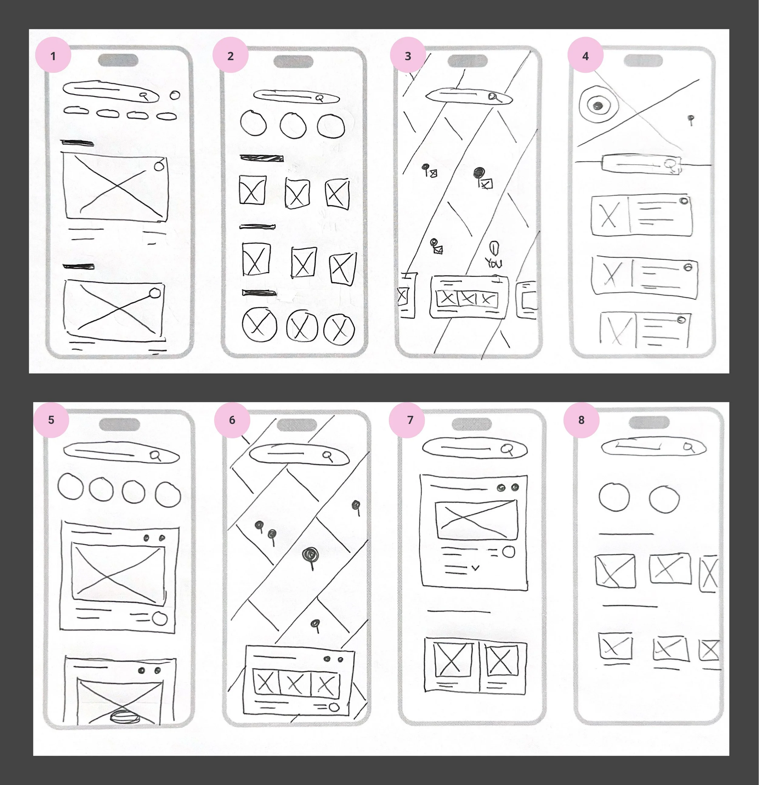
Crazy 8’s
Once I found my inspirations and narrowed down my design focus, I concentrated on the critical screens where users search for photo locations. I spent 8 minutes creating 8 different variations of the details screen, a key element in both Nick’s and Sarah’s journeys.
Day 3: Deciding
Storyboard
In revisiting the research and problem statements, I aimed to find ways to help travel lovers like Nick and Sarah discover the photo ops they are interested in. In my storyboard, I focused on three main routes:
Organizing locations into different categories and types, as well as highlighting nearby photo spots, to help users easily find their desired photo ops.
Saving a photo location for later and finding it in the app.
Finding inspirations with location details.

User flow storyboard
[From wireframes to high-fidelity mockups]
Day 4: Prototyping
Refining the Solution
On Day 4, I used Figma to create high-fidelity screens and a prototype. For the visual design, I adopted a simple yet straightforward approach to convey friendliness and inspiration while incorporating GramCity’s brand colors.

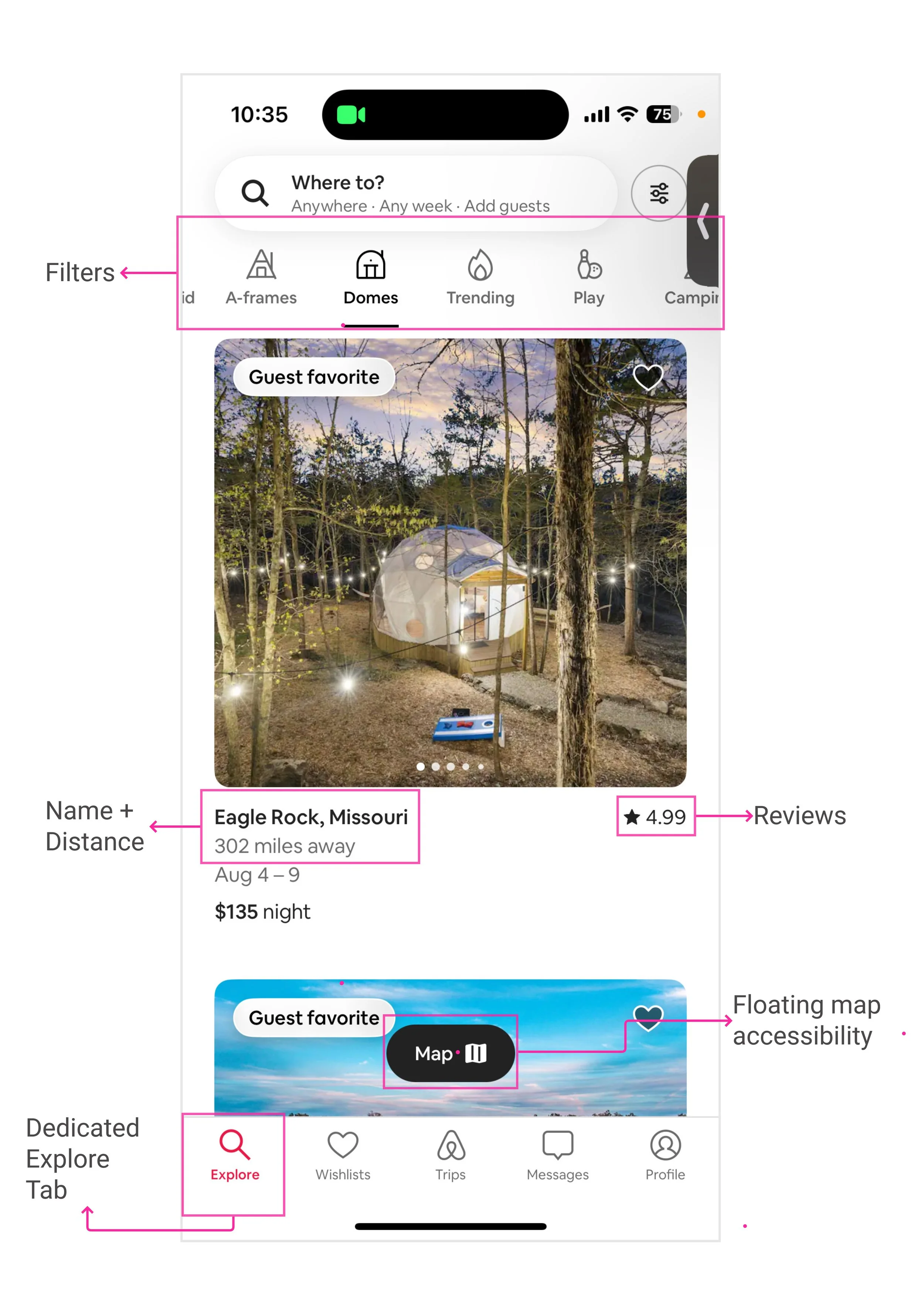
Explore page


Saved page
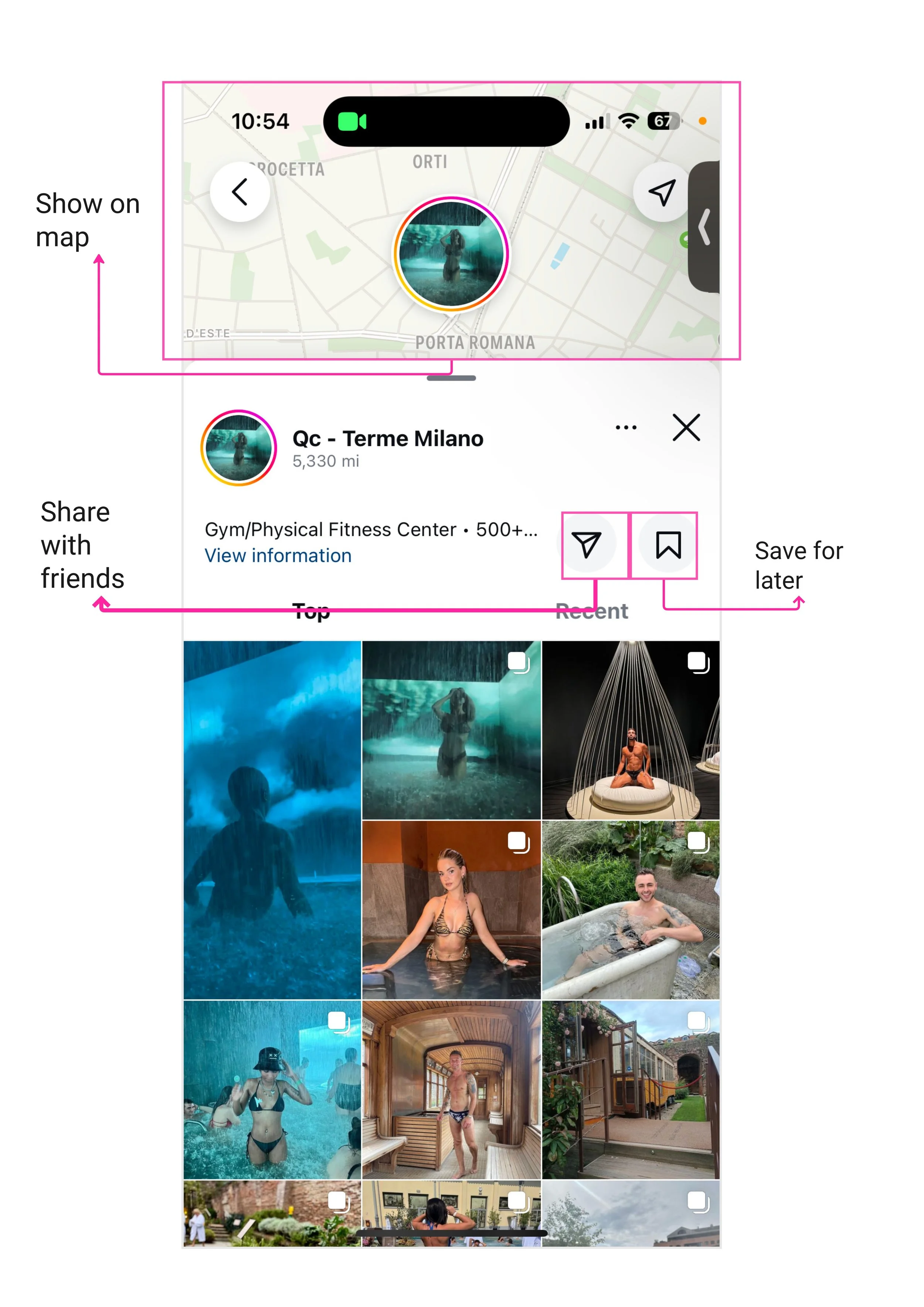
Location page

Community page
Day 5: Testing
Usability Testing
It was finally time to test the prototype! Five participants took part in usability testing and were asked to complete a series of tasks:
Find a point of interest and favorite that location.
Find favorited locations in the app.
Find other users and examples of photo opportunities shared.
Here are the critical, major, and minor issues identified during the testing:
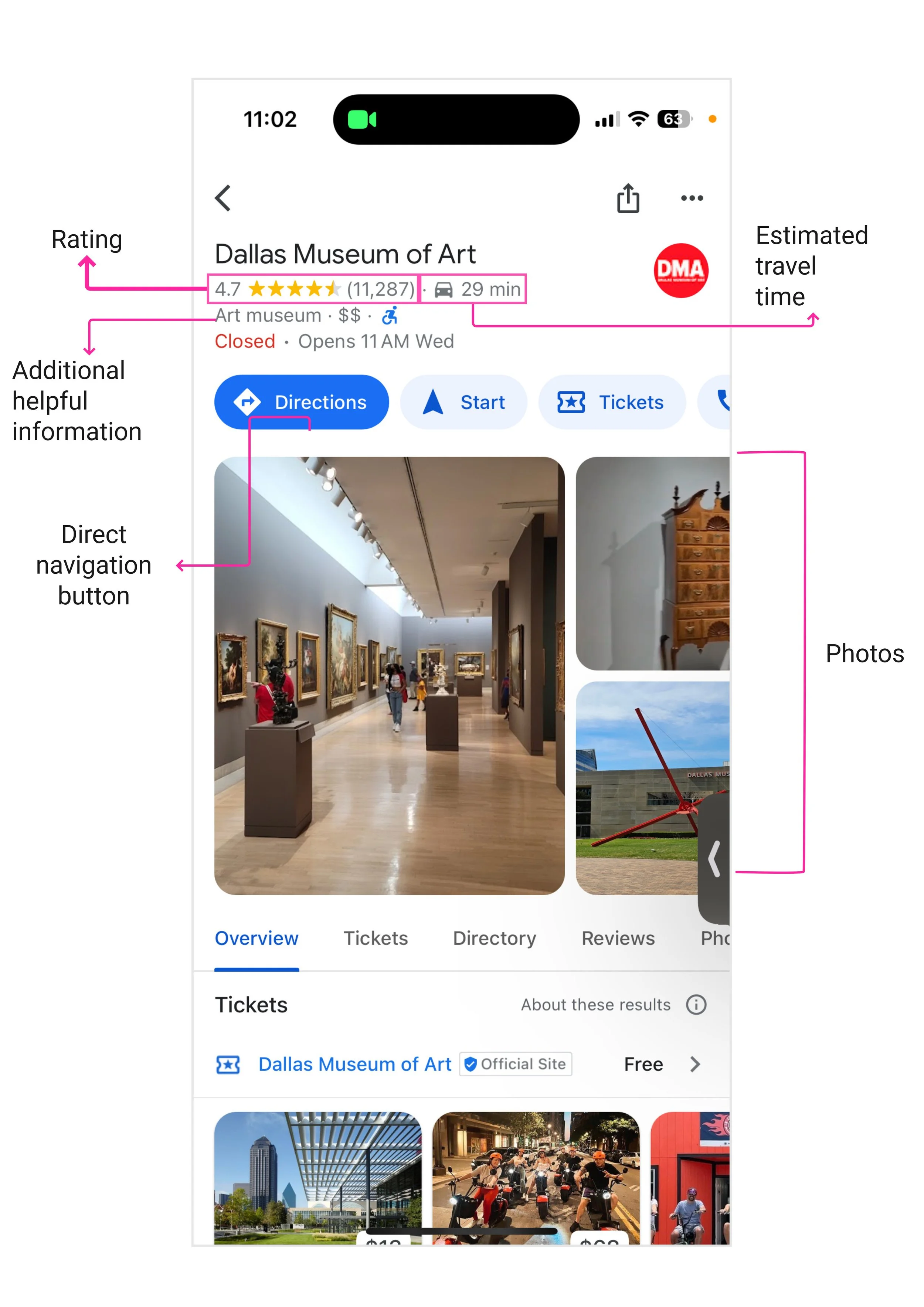
Critical Issue #1: Display of point of interest
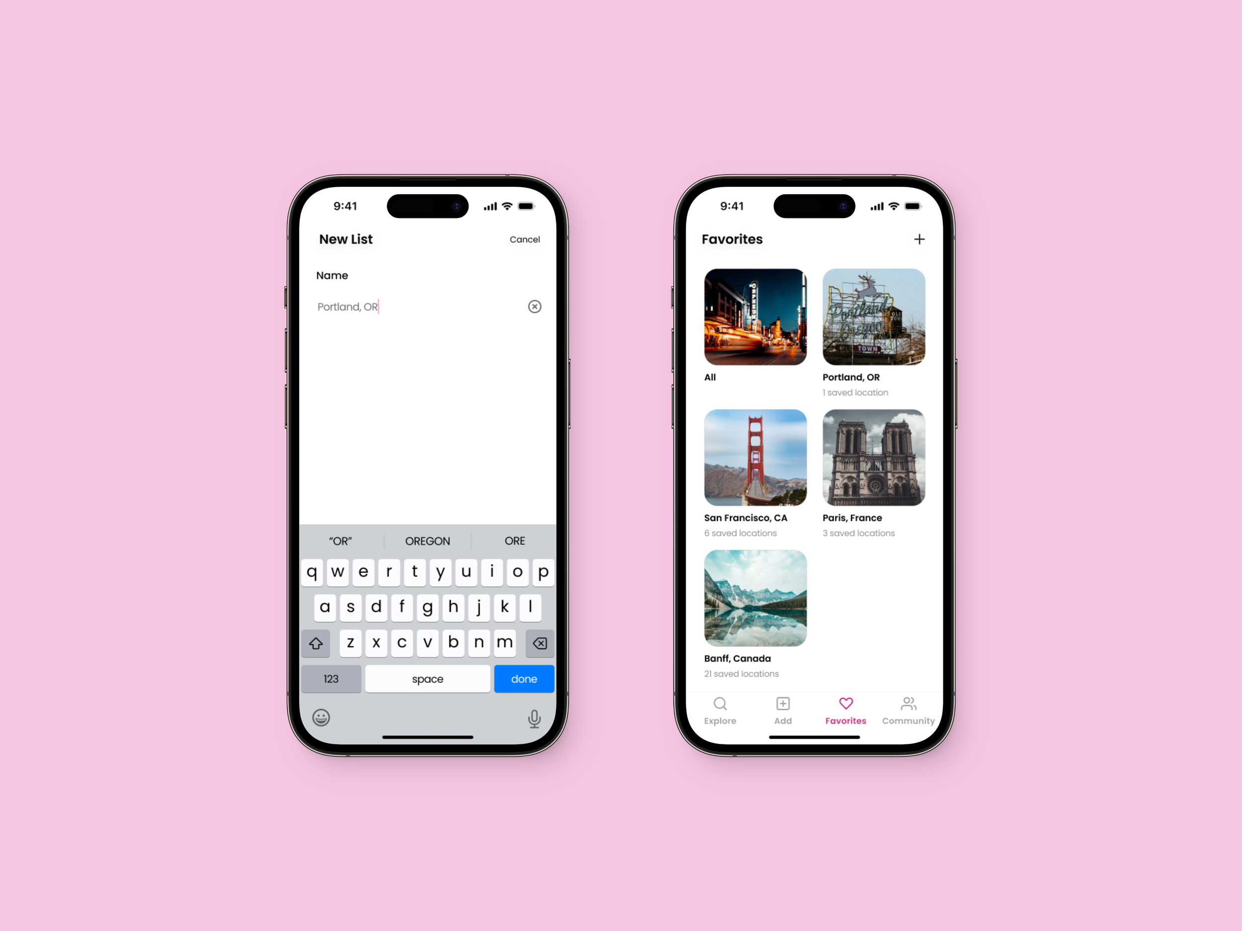
Major Issue #2: Creating a new list on the Favorites page
Minor Issue #3: Improved visibility and accessibility

Addition of navigation and user-friendly design with clearer information and more prominent location details
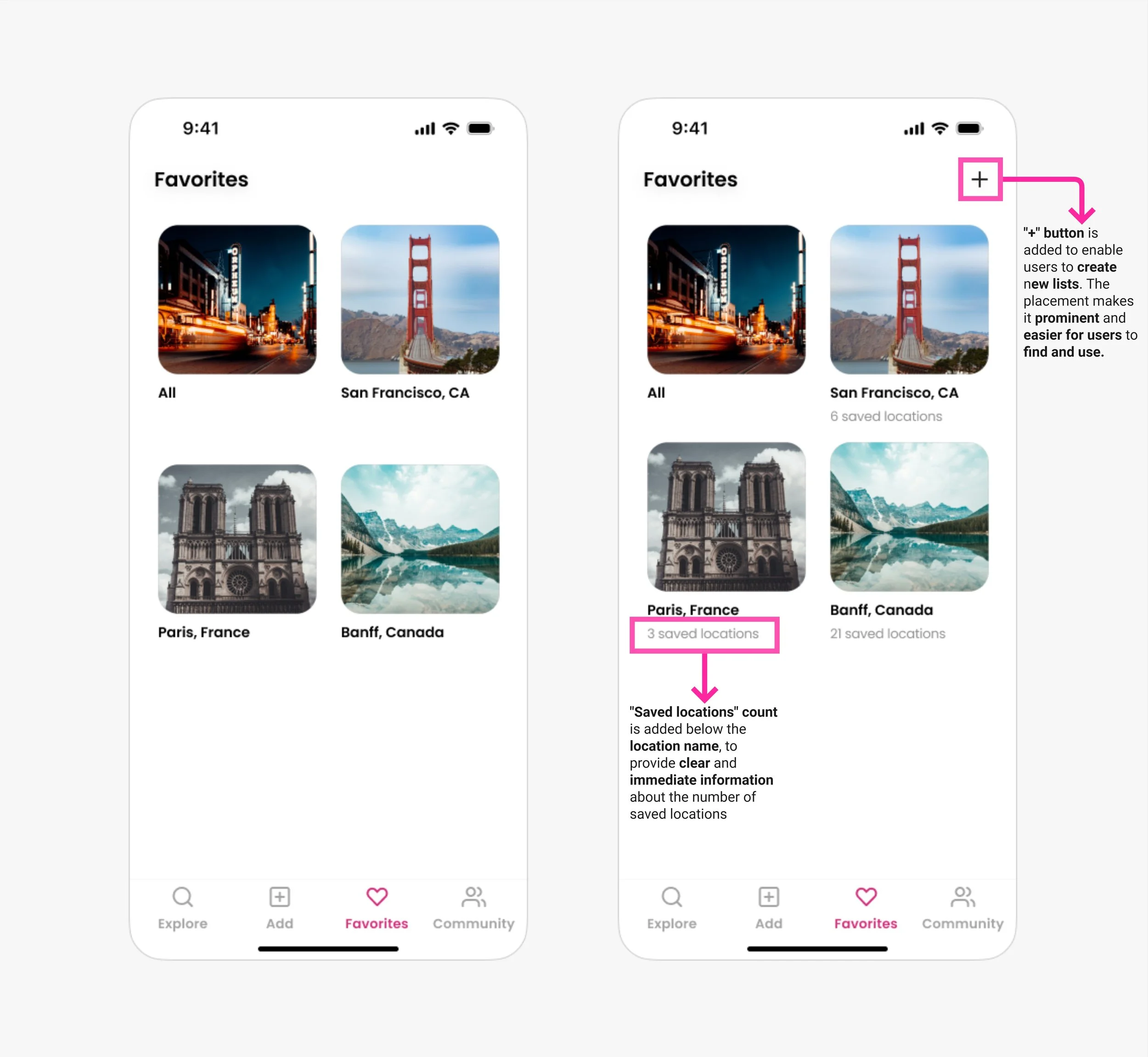
Count and "+" add CTA for list clarity
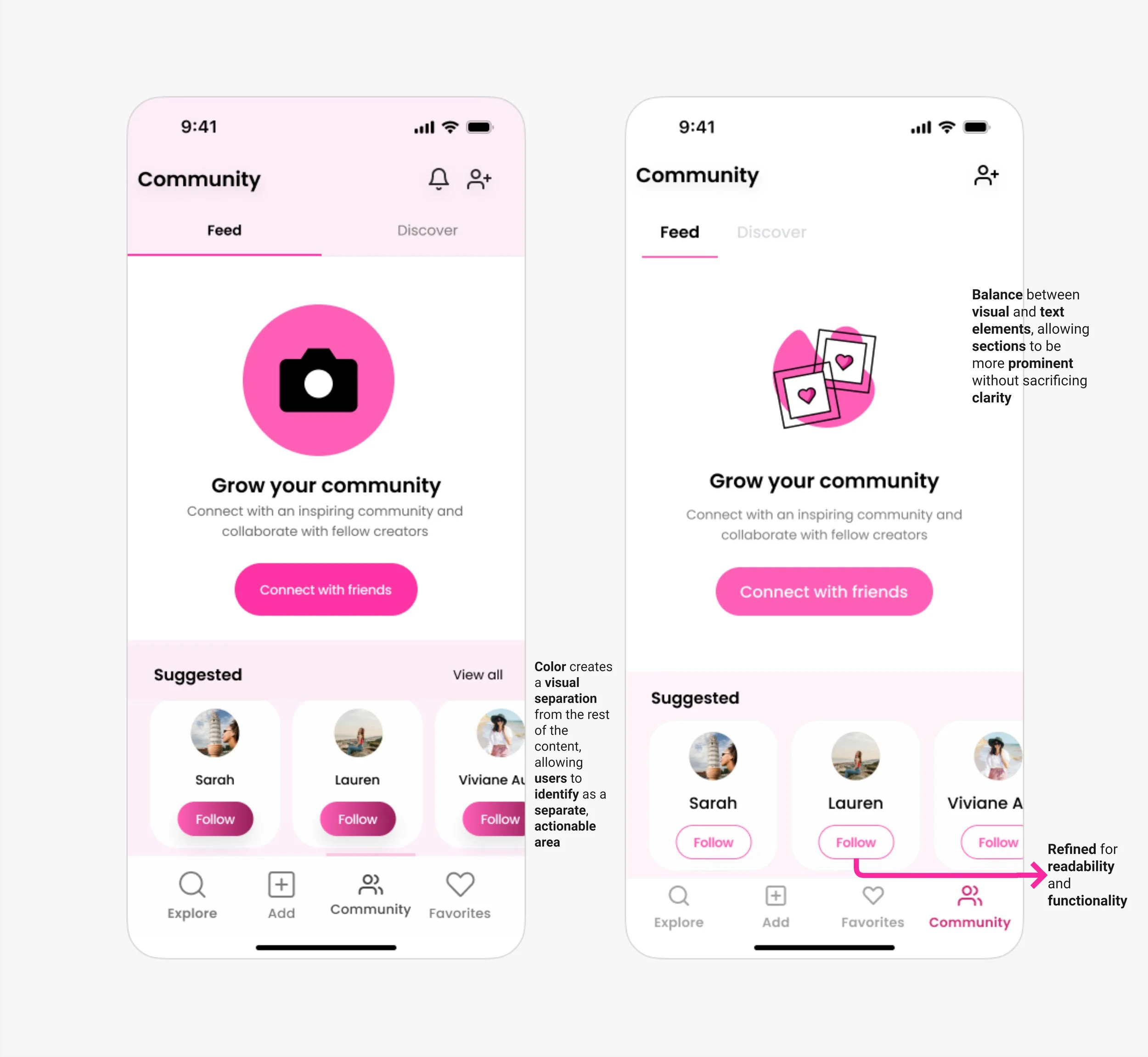
Improved clarity and visual hierarchy
Retrospective
Reflecting on the process after concluding the sprint, I realized that the intensity brought on by the time constraint of the 5-day design sprint was challenging compared to the traditional waterfall approach; however, the results were rewarding. This method allowed me to focus on the core issue, rapidly develop a minimum viable product (MVP), and implement efficient solutions.
Moving forward with this project, I plan to refine my design based on insights gathered from user testing to enhance the overall user experience. Additionally, I'm eager to further develop the filter option and design a user profile page to add more functionality and personalization to the product.
Feel free to explore the interactive prototype below and add me on LinkedIn!