
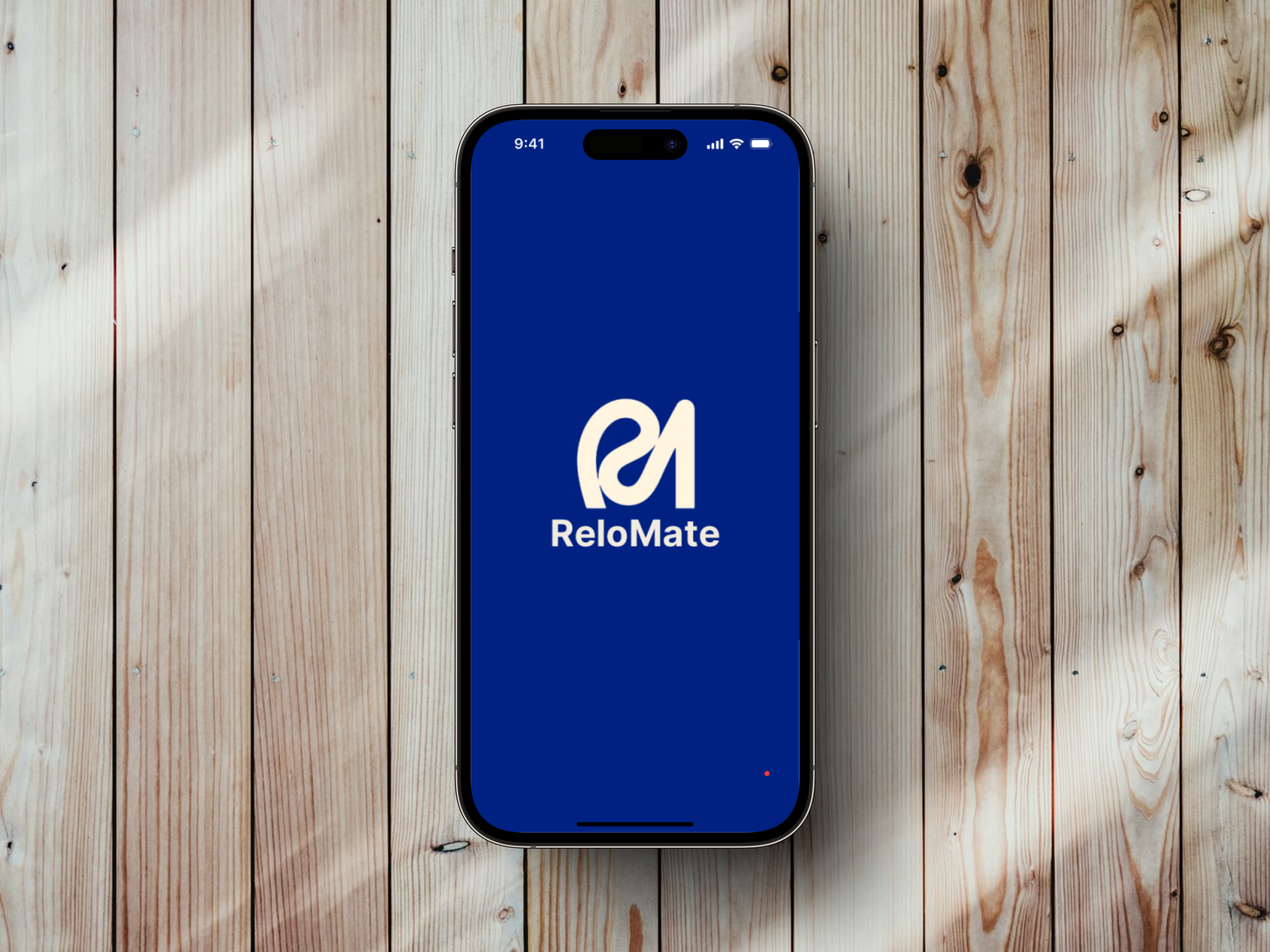
ReloMate
ROLES
UIUX Design and Research, Brand Identity
TOOLS
Figma, Miro, Marvel, Google Docs and Slides
During the COVID-19 pandemic, many faced the daunting task of relocating for jobs. Remote work and the need to find employment pushed individuals to move, often with little guidance. My boyfriend, too, had to relocate to a different state for a new job. The process was overwhelming and confusing, with no clear starting point or next steps. This led me to wonder: Can we create something to address these issues and make the moving process smoother and less stressful. Using the design thinking methodology (Empathize, Define, Ideate, Prototype, and Test), ReloMate was created, a relocation management app that seeks to streamline and simplify the moving process and reduce stress and anxiety for individuals moving to a new location for work.
The Making of ReloMate
User Research Insights
After defining the problem, I researched the relocation-for-work process and industry, followed by a heuristic analysis of the three leading service-based mobile apps. My findings validated the need for a solution that provides much-needed support in an underserved market, as there was little digital assistance available for relocation.
Moving forward, I conducted a screener survey that identified five participants who fit the target audience for user interviews. The results showed:
Sixty percent revealed that the logistics of relocation caused stress and uncertainty.
Every user felt overwhelmed and unsupported by the challenges of managing the relocation process.
Users struggled to find reliable information and resources, often unsure of their next steps.
Many faced unexpected costs and delays, which increased their stress.
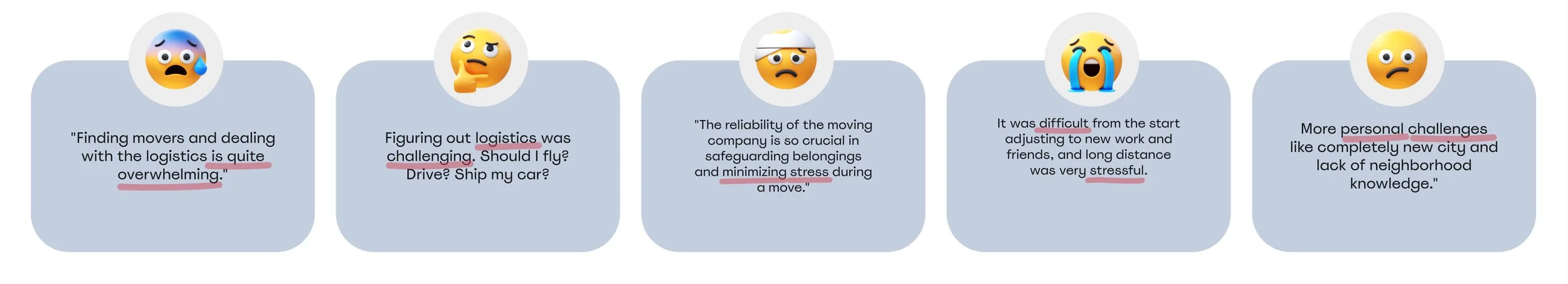
Interview summaries
Affinity Mapping and Discovering User Needs
By synthesizing the raw user research data through affinity mapping, I uncovered two key insights:
Job relocation can be both stressful and enriching.
Effective planning is essential for minimizing stress.
From these insights, the key user needs emerged:
A mobile-only app.
A task management feature that breaks down the relocation process into manageable steps.
Tools for budgeting and financial planning.
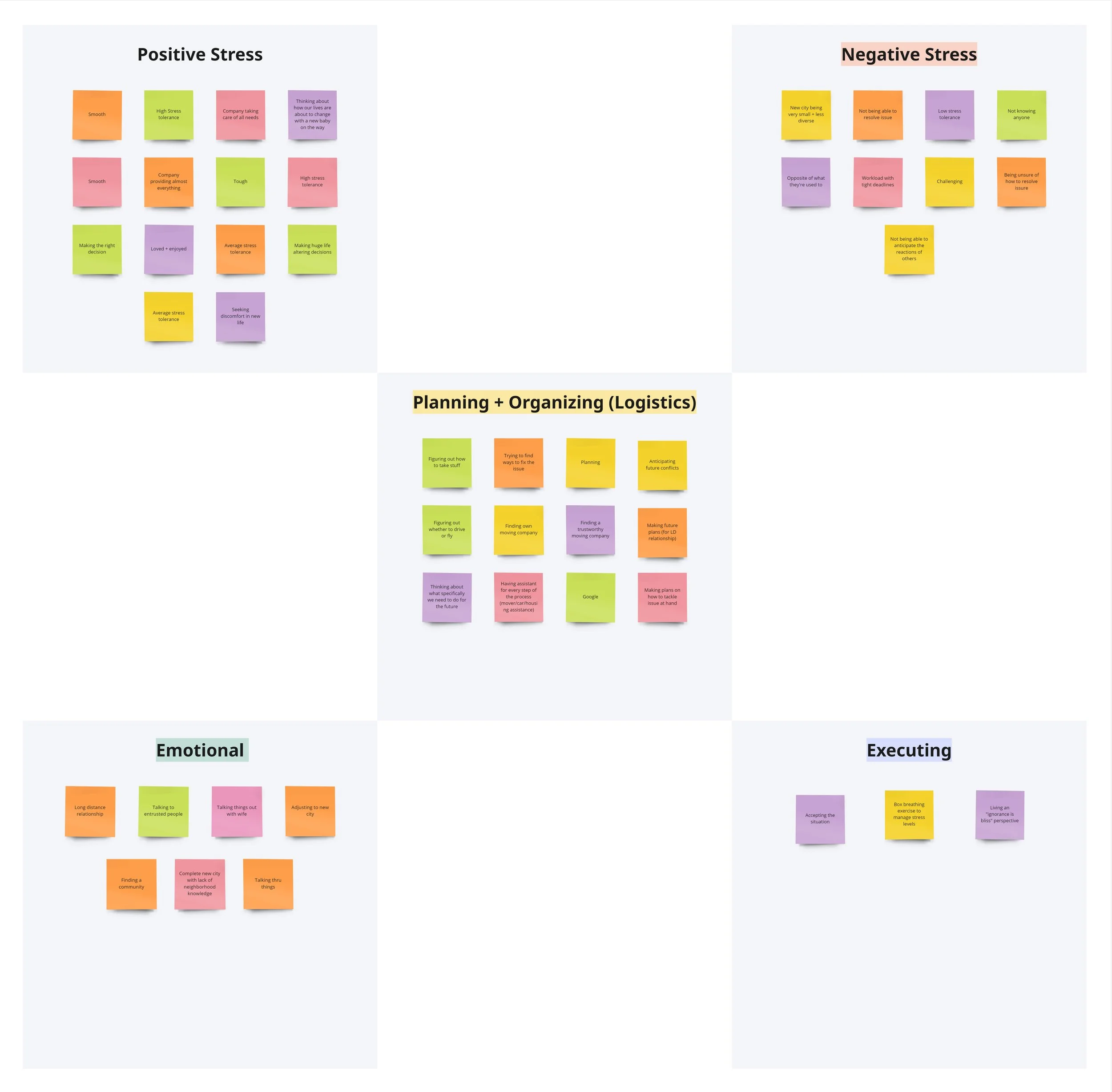
Affinity map

Empathy map
Personas
Building on these insights, I developed two personas that reflect users’ stories and mapped their journeys. This process enabled me to prioritize features for the minimum viable product (MVP), guiding my design decisions toward creating a more user-centered solution.
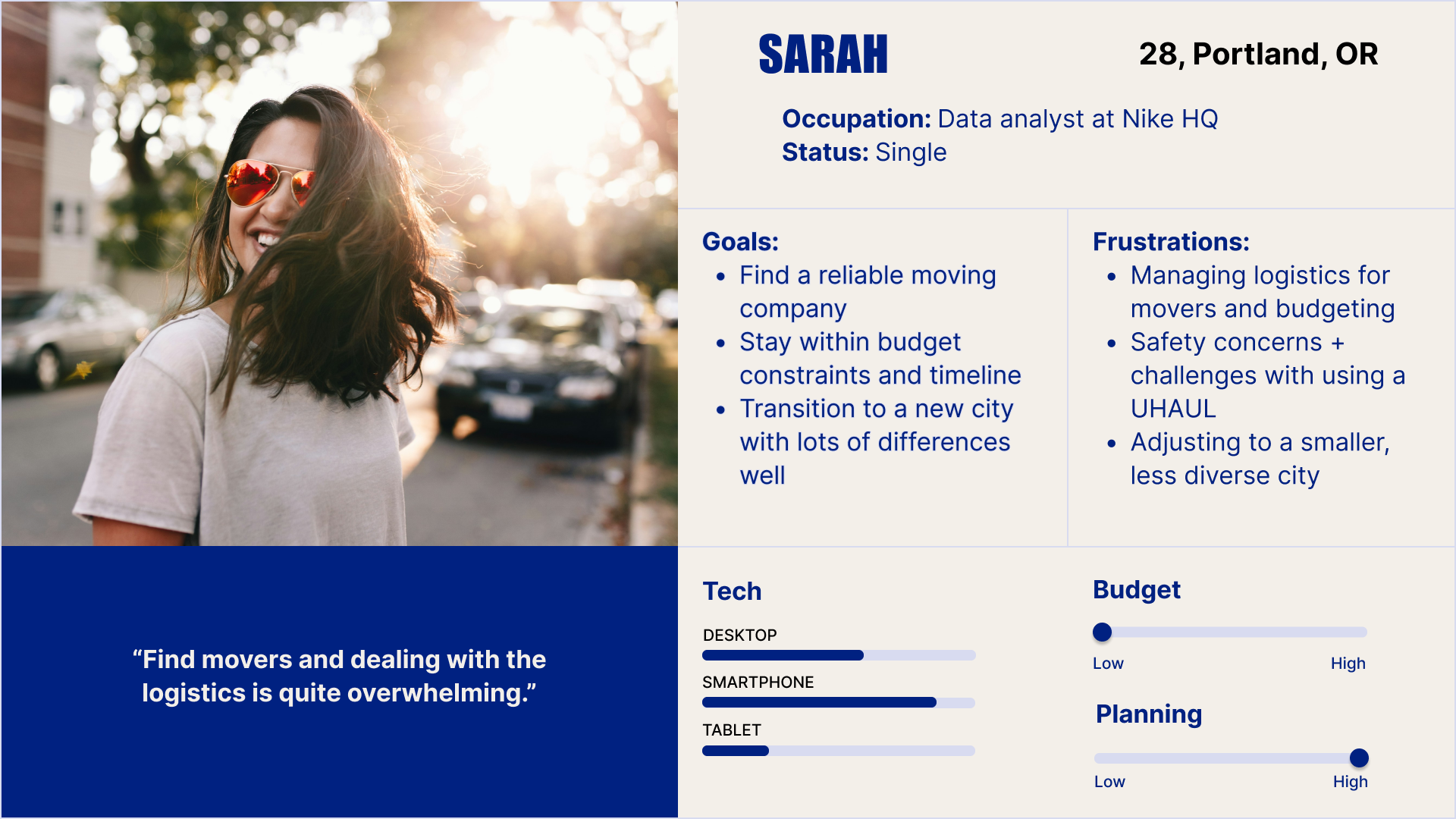
Sarah - low budget, high planning

Josh - high budget, low planning
How Might We… Reduce the Stress?
I reframed my insights into How Might We (HMW) questions to help better align with users’ tasks and goals:
How might we simplify the relocation process to minimize stress and anxiety for individuals moving to a new location for work?
How might we create a personalized relocation platform that tailors information, resources, and supports to the unique needs of each individual?
How might we address the financial considerations of relocation, providing tools and resources for budgeting and financial planning?
How might we allow them to access their most critical relocation-related information through their mobile devices?
Core user flow
How Do We Cure the Pain Points?
Based on the identified pain points, I defined three key needs for the Minimum Viable Product (MVP) to address:
"As I plan my move, I want to reduce the stress felt during the moving process to enhance my overall well being."
“As I get ready to relocate, I want to track and categorize my relocation expenses to maintain a detailed record of my financial transactions.”
"As I start my process of relocating, I want a checklist that breaks down the relocation process into manageable steps, and I want to be sent reminders and
deadlines so that I can stay organized and stress-free.”
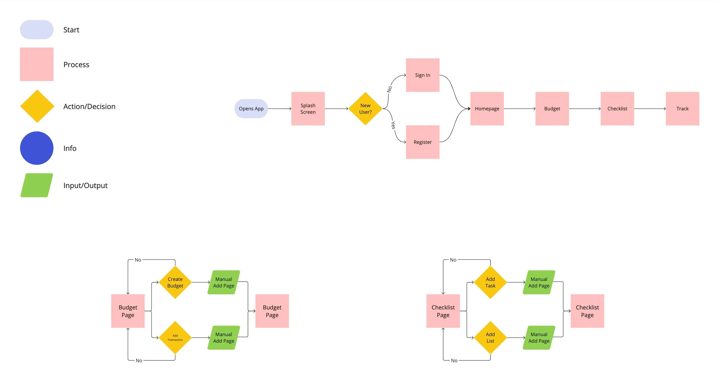
Curating the Flow
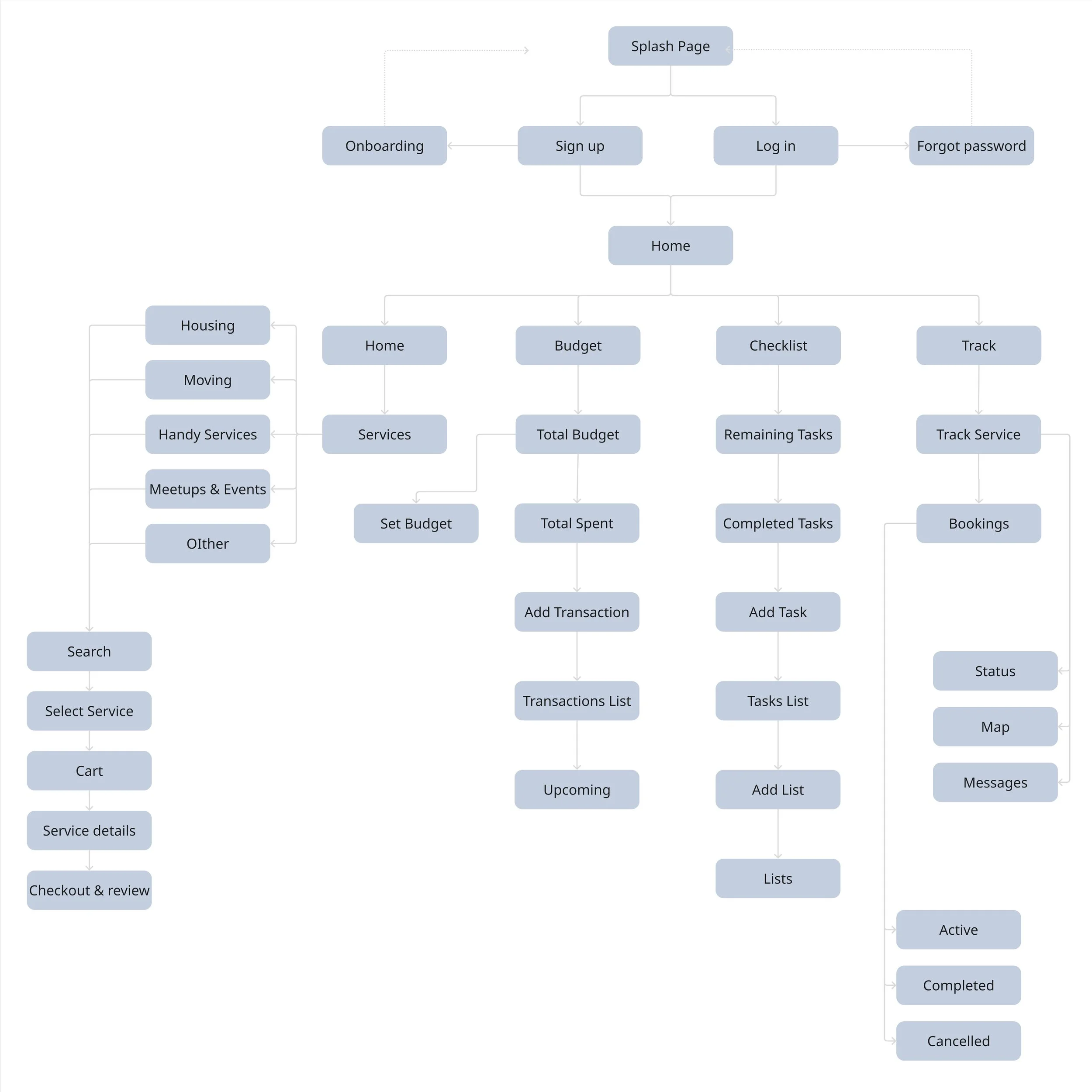
Site map
Understanding user needs, I focused on ReloMate’s information architecture through three red routes:
Red Route 1: Track budget and expenses
Red Route 2: Manage tasks with checklists
Red Route 3: Receive crucial notification
I decided on crucial actions and features, designing a sitemap based on these conclusions. I aimed to create a seamless user experience, emphasizing simplicity while balancing customization of information and experience.
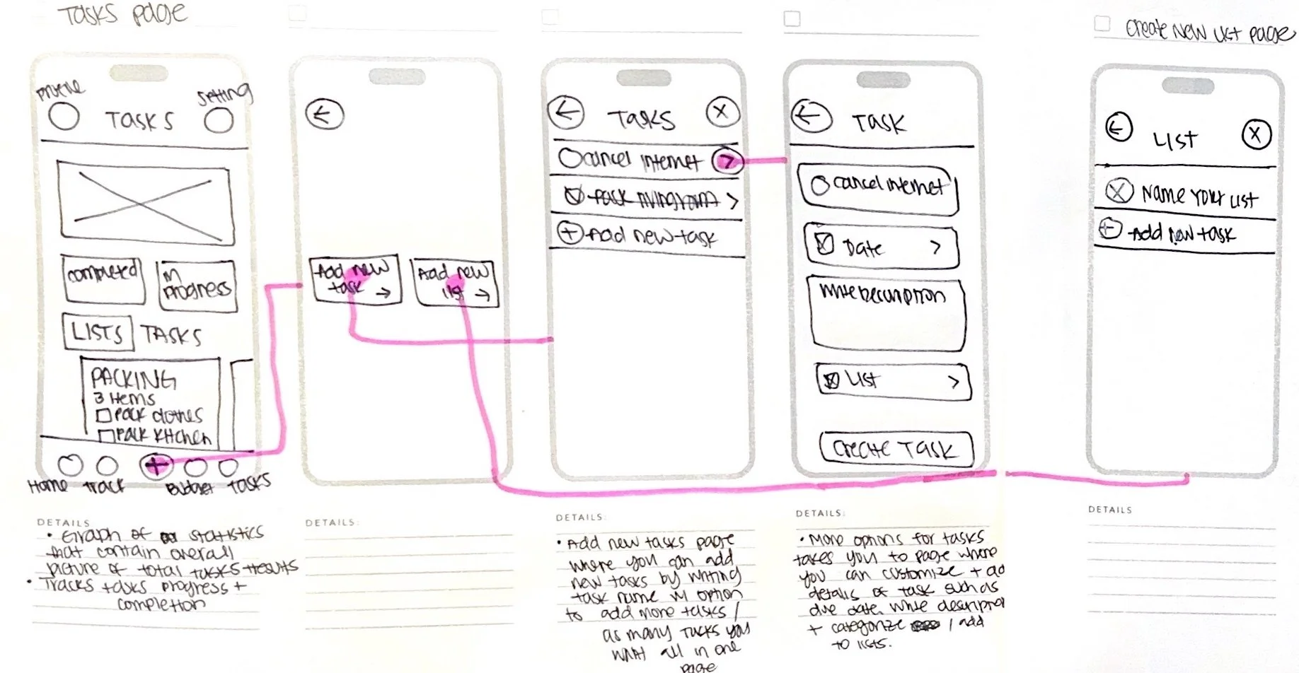
Sketches of adding new taskSketches - Visualizing ReloMate
I sketched the MVP red routes with pencil and paper, then created a low-fidelity prototype for guerrilla usability testing. Test findings focused on critical user flows: budgeting and task management. Test findings were:
Need for more intuitive budget categories
Desire for customization features in budget creation
Need for clearer instructions on task page
Limited task editing capabilities
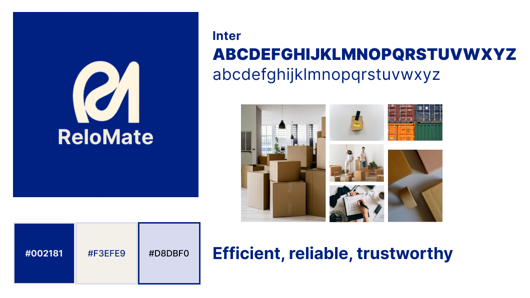
ReloMate Style GuideStyle Guide
“ReloMate” combines ‘relocation’ and ‘mate’ to emphasize its focus on making the relocation process easier. ‘Relo’ highlights the core purpose, while ‘mate’ suggests that the product is designed to be a helpful and supportive companion during the move. Before diving into the high-fidelity designs, I created a lightweight style guide to establish the look and feel of the app, ensuring a consistent visual style for the users of ReloMate.

Low-fidelity wireframes to high-fidelity mockups - Budget page
Interaction Flows
With user research and information architecture completed, I crafted low-fidelity wireframes of ReloMate’s mobile app in Figma. My goal was to create a simple representation of user flows for usability testing.
Low-Fi to High-Fi
I tested the low-fidelity prototype in five usability sessions, uncovering key areas for improvement. My first iteration of hi-fi mockups revealed that the app was losing its focus on creating a seamless user experience with simplicity. I redesigned the flow to ensure the design was optimized, visually appealing, and well-structured. Drawing inspiration from popular travel planning apps, I studied how they guide users through complex journeys.
The latest redesign of ReloMate focuses on intuitive navigation and efficiency, aiming to reduce unnecessary steps. My primary goal was to create an app that simplifies the moving process with an easy-to-use interface.
Five participants took part in usability testing, which followed a structured interview guide. The test involved completing the following five tasks:
Create a new budget
Add a new transaction
Add a new task
Mark a task as complete
Create a new list
Here are the major, critical, and minor issues identified during testing:
Guerrilla Usability Testing
Critical Issue #1: Disruptive task + list addition
Participants found that adding new transactions and tasks were cumbersome and interrupted their flow, leading to frustration.
Major Issue #2: Limitations of scroll function
The scrolling feature was often unresponsive or slow, making it difficult for users to navigate through longer lists efficiently.
Minor Issue #3: Insufficient visibility and organization
Users reported difficulty in finding specific items due to poor visual hierarchy and inadequate labeling of sections within the app.
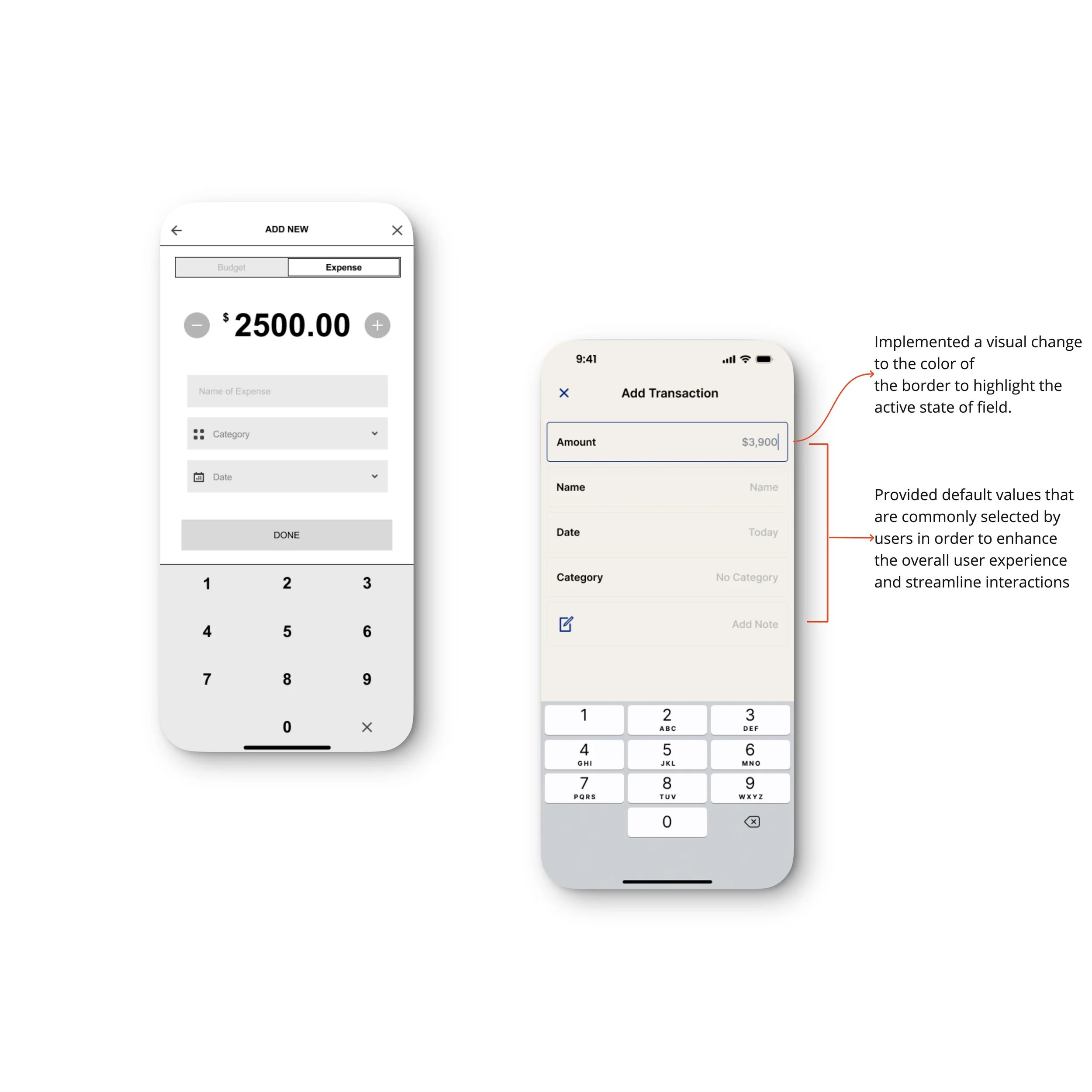
Add Transaction screen
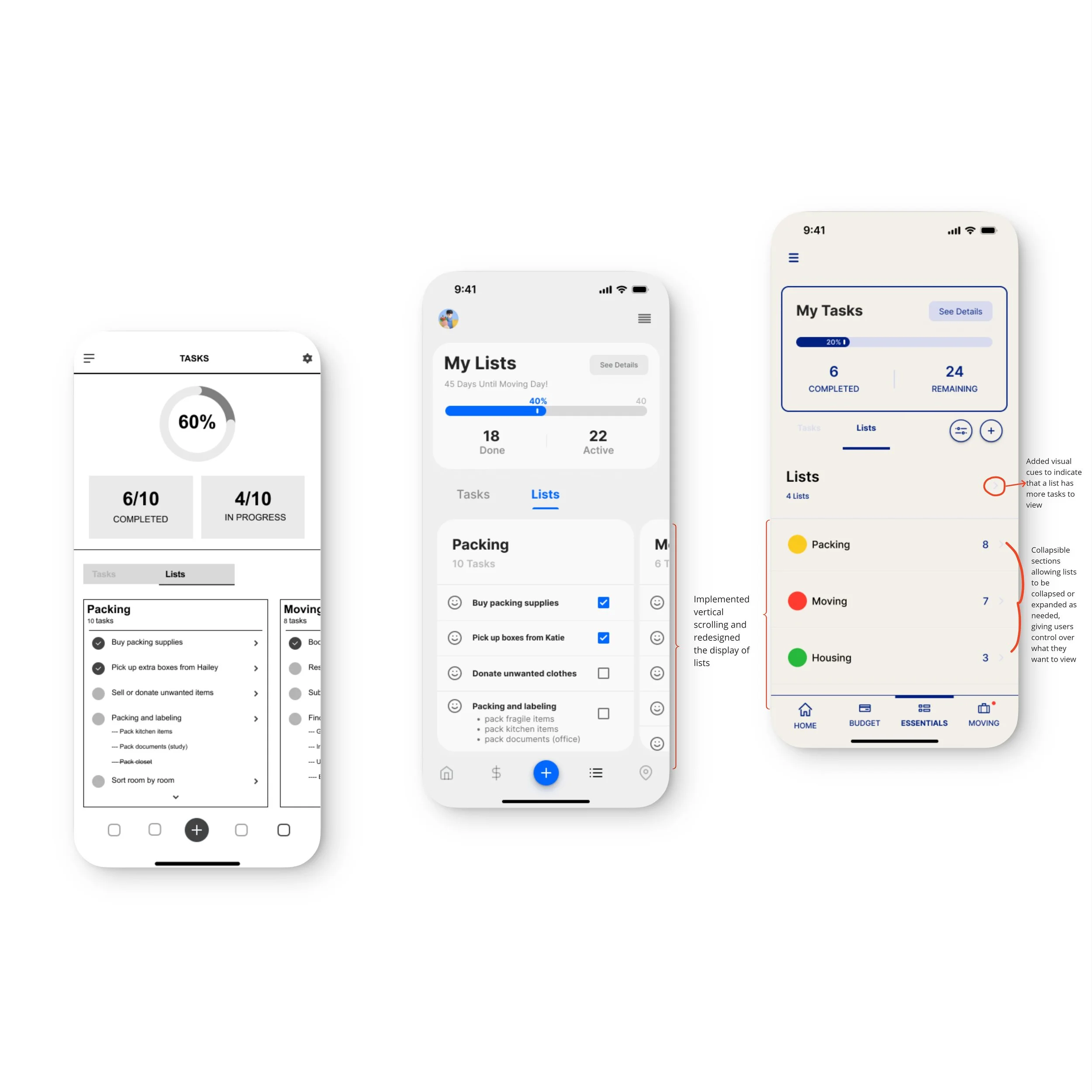
To-do lists screen
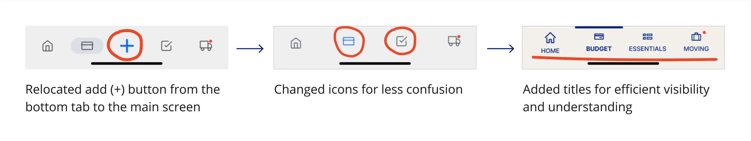
Bottom navigation bar


Retrospective

Having witnessed someone close to me relocate, this project became deeply personal. Each step of the design process revealed why every detail matters and how even small adjustments impact the outcome. I loved seeing usability testers bring fresh perspectives to the project I'd been building for weeks. Implementing their suggestions and watching the product improve was incredibly rewarding.
One key lesson I learned is to consistently think of 'How Might We' throughout the entire UX process. I tend to forget problem statements during the design phases, but they are crucial for providing clear direction to the solution.
There is still a lot more to explore with ReloMate. What if a real-time chat support was added allowing users to ask questions and seek assistance throughout their relocation journey? What if we offer cloud storage for important documents and records related to the relocation, making them accessible at any time? What if we partner with financial institutions or advisors to offer personalized financial planning services, helping individuals make informed decisions about their finances during the move. These are just some of the questions I'd like to expand on as I continue to work on this project. But for now, feel free to check out the current state of the app by clicking 'ReloMate Prototype' below, and add me on LinkedIn!